
When it comes to web design, color is more than just an aesthetic choice—it’s a tool that can influence user behavior, guide navigation, and set the mood for a website. The right color palette can make your website visually striking, easy to navigate, and engaging. But how do you select the perfect colors that are both beautiful and functional ? The answer lies in understanding color theory in web design.
In this article, we’ll explore the foundational principles of color theory, its impact on user experience, and how you can create effective color schemes that elevate your design and connect with your audience.
What is Color Theory in Web Design?
Color theory is a science that explains how colors interact with one another, and it plays a critical role in visual communication. In web design, it’s essential to understand the balance between colors and how they impact readability, branding, and user engagement.
The Basics of Color Theory
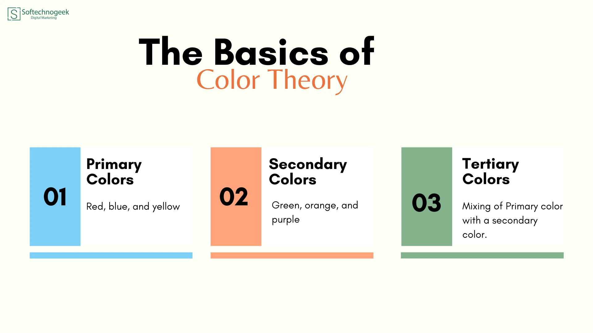
- Primary Colors: Red, blue, and yellow. These are the foundation for creating all other colors.
- Secondary Colors: Green, orange, and purple, made by mixing primary colors.
- Tertiary Colors: These are the results of mixing a primary color with a secondary color.
The theory extends to how colors work together, such as complementary, analogous, and triadic color schemes, each offering a different visual effect.
Creating Aesthetic and Functional Color Palettes
While it’s tempting to focus purely on the visual appeal of colors, web design requires that color choices be functional as well. A good palette doesn’t just look great; it enhances readability, accessibility, and interaction.
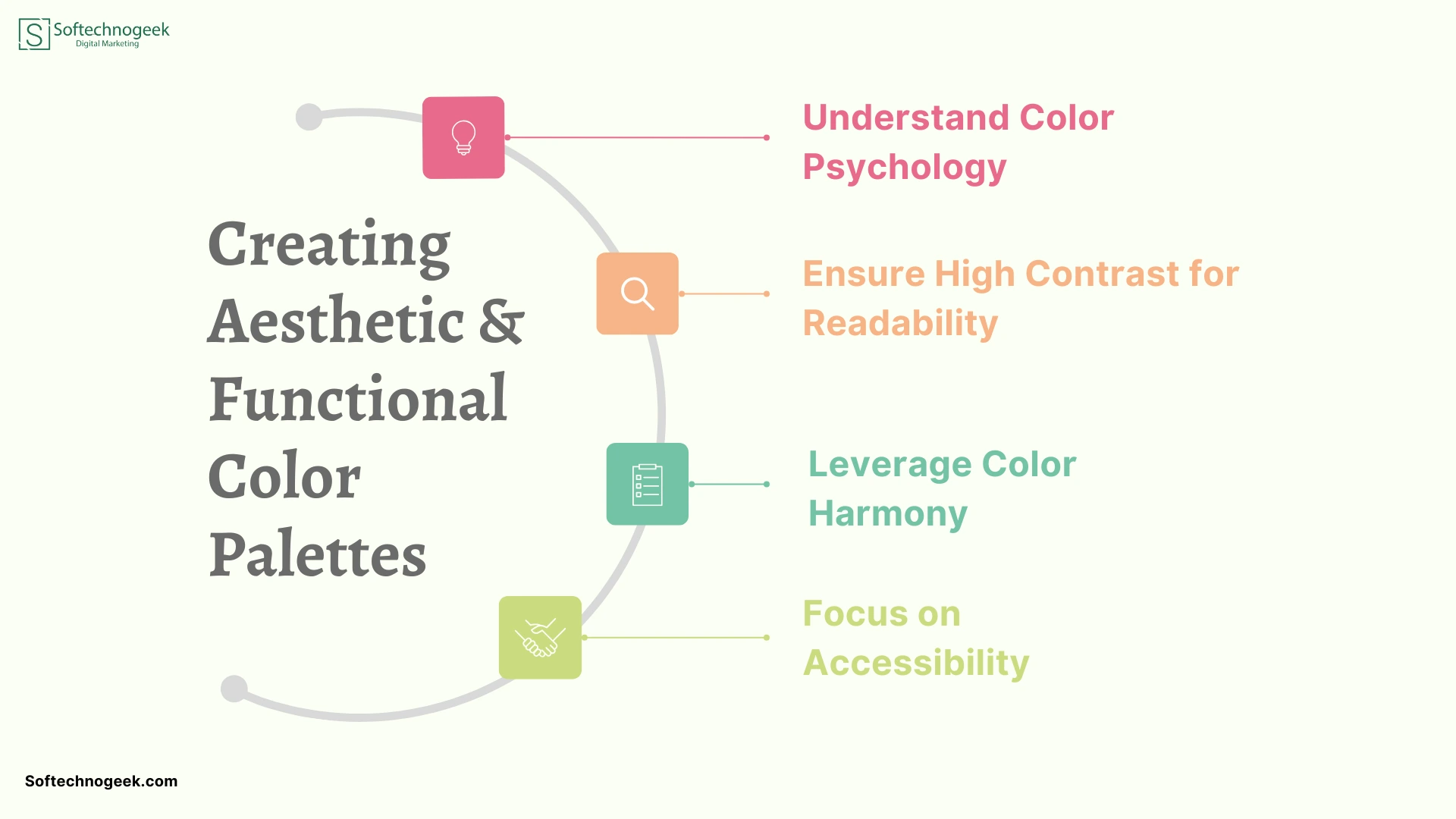
1. Understand Color Psychology
Colors evoke emotional responses, and selecting the right color palette for your site can influence your audience’s perception of your brand. Here’s how different colors are often perceived:
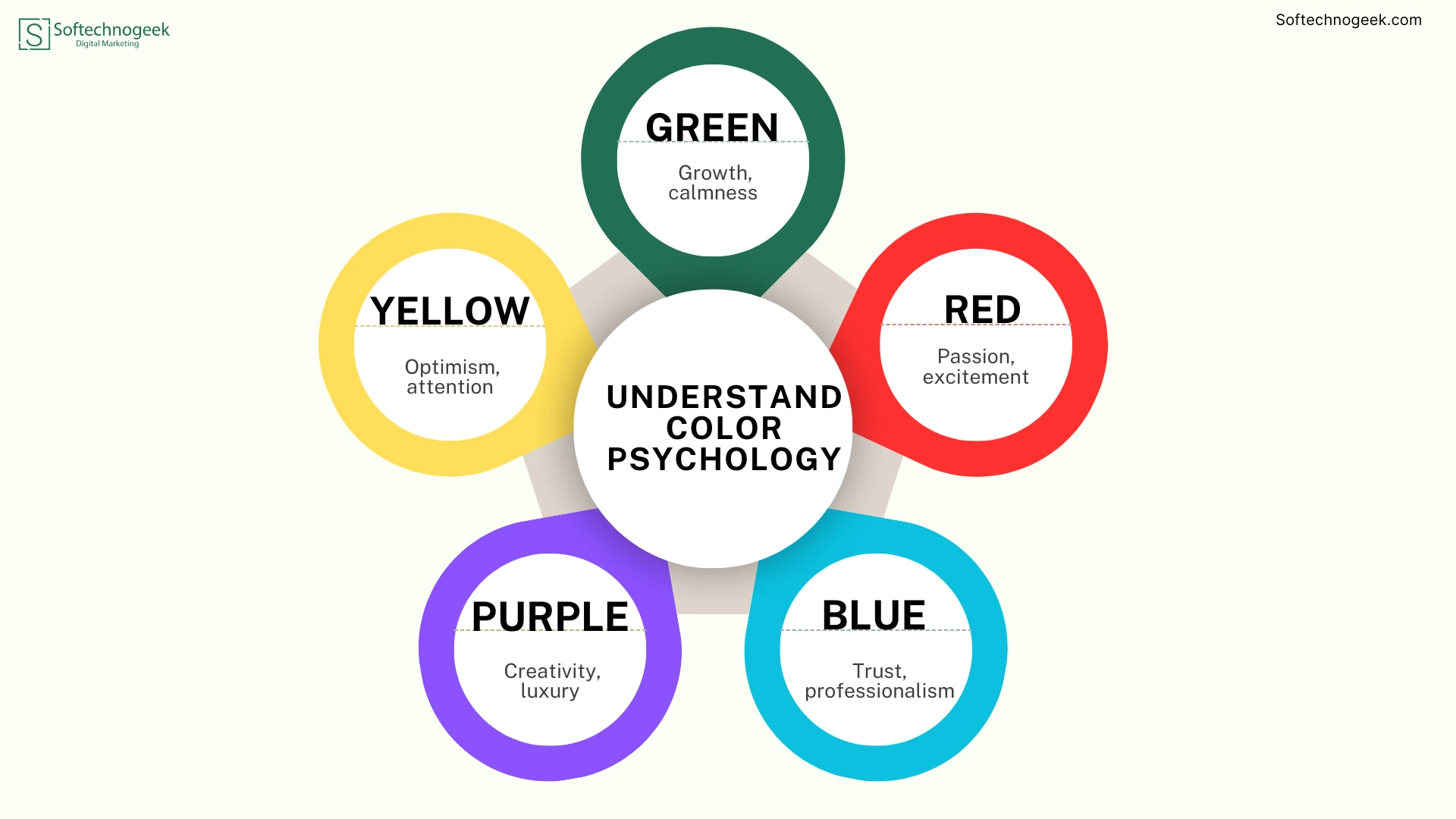
- Blue: Trust, professionalism
- Red: Passion, excitement
- Green: Growth, calmness
- Yellow: Optimism, attention
- Purple: Creativity, luxury
By using these color associations, you can guide user behavior and improve engagement.
2. Ensure High Contrast for Readability
One of the most critical considerations in web design is legibility. Your website’s text should always be easy to read against the background. This is where high contrast comes in. For instance, white text on a dark background can enhance readability, especially in long-form content or call-to-action buttons.
3. Leverage Color Harmony
The concept of color harmony means selecting colors that naturally work well together. Three main types of harmonious color schemes are:
- Complementary: colors are those that are opposite one another on the color wheel, such as orange and blue.
- Analogous: Colors that are adjacent to one another on the color wheel, such as green, blue, and blue-green.
- Triadic: Three evenly spaced colors (e.g., red, blue, yellow).
These schemes ensure a balanced and visually pleasing design that’s not overwhelming to the eyes.
4. Focus on Accessibility
It’s essential to remember that not all users perceive colors in the same way. Many users are colorblind, and it’s important to ensure that your design remains functional and accessible. Tools like color contrast checkers can help you ensure that your color choices meet accessibility standards.
Additionally, incorporating patterns or textures can be a useful alternative to relying on color alone.
Color Theory in Practice: Case Studies and Examples
Let’s look at some real-world examples where color theory is put into action:
- Apple – Apple uses a minimalist color palette with a lot of white space to create an elegant, clean, and modern aesthetic. The focus is on simplicity, allowing the products to stand out.
- Spotify – Spotify’s use of dark greens and blacks creates a sleek and modern feel while allowing the album art to pop.
In both cases, the brands have used color theory to communicate their brand values effectively and ensure a great user experience.
Common Mistakes to Avoid When Using Color in Web Design
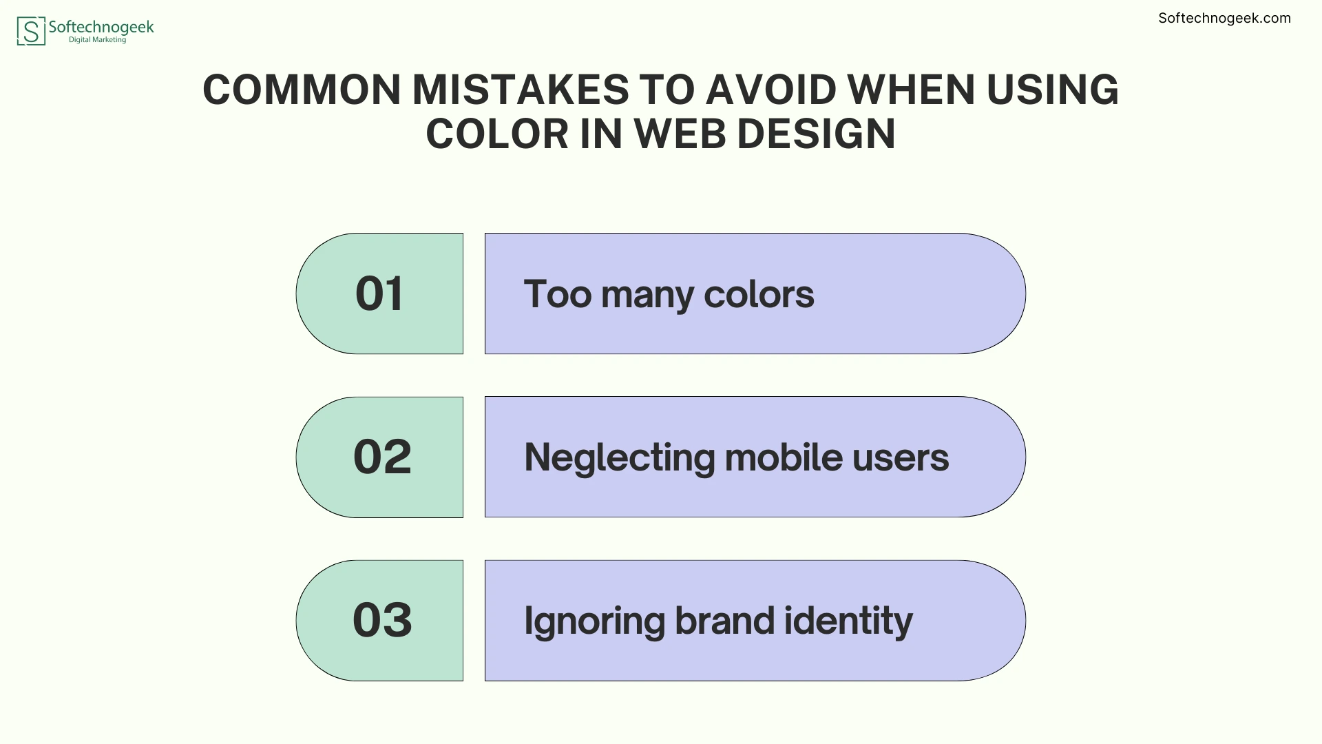
- Too many colors: Overloading a design with too many colors can be overwhelming and distracting. Stick to a primary color palette with complementary accent colors.
- Neglecting mobile users: Always test your color scheme across different devices and screens, ensuring the color balance remains consistent.
- Ignoring brand identity: Your color choices should reflect your brand’s personality. Ensure the colors align with your brand’s mission and message.
Tools to Help You Create Color Palettes
Several online tools can assist you in selecting the perfect color scheme:
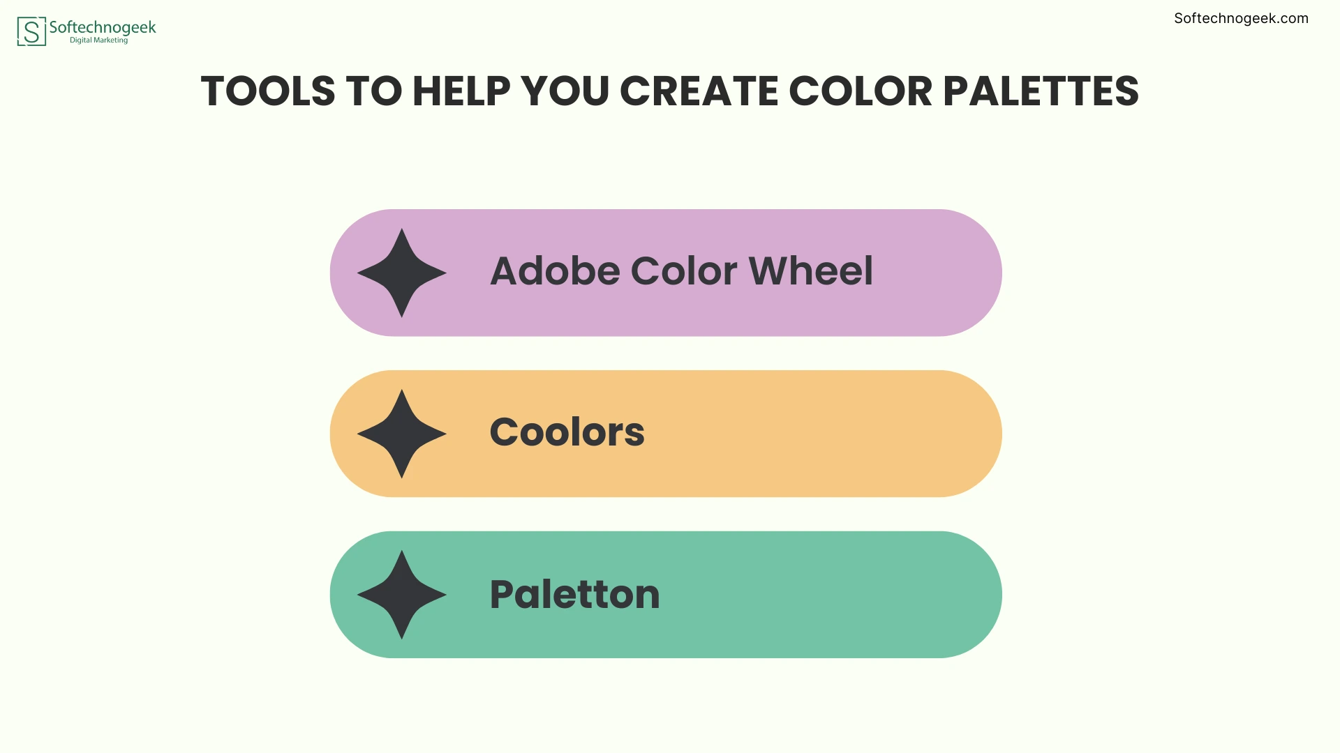
- Adobe Color Wheel: A powerful tool that lets you explore complementary, triadic, and analogous color schemes.
- Coolors: Generate color palettes with ease and adjust based on your needs.
- Paletton: A color scheme designer that provides real-time previews of your palette.
Frequently Asked Questions
Q1. What is color theory in web design?
Color theory in web design refers to the principles of how colors interact, influence perceptions, and impact the user experience on websites. It helps designers create color schemes that are both visually appealing and functional.
Q2. How do I choose the right color palette for my website?
To choose the right palette, consider your brand identity, the emotions you want to evoke, and ensure a good contrast for readability. To achieve harmony, use color schemes that are triadic, analogous, or complementary.
Q3. Why is accessibility important in color design?
Accessibility ensures that users with visual impairments, like color blindness, can still navigate and interact with your website. Using high contrast and alternative indicators, like textures or patterns, is crucial.
Q4. What is the best way to test color contrast for readability?
Use online color contrast checkers like WebAIM or the Adobe Color Wheel to test your color choices and ensure they meet WCAG standards for accessibility and readability.
Q5. Can I use more than three colors in web design?
While it’s common to stick to a primary color scheme with two or three colors, you can use more if done thoughtfully. Too many colors can overwhelm the design, so focus on balancing your main palette with complementary accent colors.
Conclusion
Color theory in web design isn’t just about choosing pretty colors; it’s about creating functional and visually cohesive designs that enhance the user experience. By understanding color psychology, ensuring high contrast, and applying harmonious color schemes, you can craft websites that are not only aesthetically pleasing but also highly effective in guiding users through their journey. Whether you’re designing for readability, brand identity, or accessibility, mastering color theory will elevate your designs and improve overall user satisfaction.
Start applying these color theory principles to your projects today and watch how the right palette can transform your web designs!